Imagine opening your morning newspaper and finding an almost empty page with just a few lines of text. No logo. No product. No company name.
Instead, it simply says:
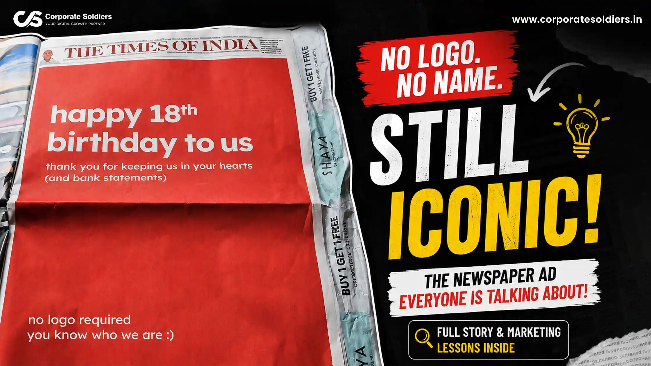
“Happy 18th birthday to us.”
“Thank you for keeping us in your hearts (and bank statements).”
“No logo required. You know who we are :)”
This simple yet bold advertisement immediately sparked curiosity across social media. Readers began asking one question:
Which brand is this?
Whether or not people guessed correctly, the advertisement had already achieved its objective – it got everyone talking.
Why This Advertisement Went Viral
Unlike traditional advertisements filled with product images, offers, and logos, this campaign relied entirely on brand recognition.
The creators trusted that their audience could identify the brand without seeing its identity.
That level of confidence is only possible when a brand has built years of awareness and customer loyalty.
The Psychology Behind “No Logo Required”
This advertisement uses several proven marketing principles.
1. Curiosity Marketing
Humans naturally try to solve mysteries.
When readers don’t immediately recognize the advertiser, they continue thinking about it, search online, discuss it with friends, and share it on social media.
The advertisement continues working long after someone has turned the newspaper page.
2. Strong Brand Recall
Brand recall means customers remember your brand without seeing your logo or hearing your name.
Only a handful of companies have reached this level.
Instead of introducing themselves, they simply remind people that they already know them.
3. Minimalism
Most newspaper advertisements are crowded with:
- Offers
- Product images
- QR codes
- Contact details
- Promotional messages
This campaign does the exact opposite.
The large empty space immediately grabs attention because it looks different from everything else on the page.
4. Emotional Connection
The line
“Thank you for keeping us in your hearts (and bank statements).”
is clever because it combines appreciation with humor.
Customers feel acknowledged while the brand playfully references the financial relationship they have built over the years.
Breaking Down the Design
The advertisement follows a very clean visual hierarchy.
Background
A single coral-red color dominates the page.
Typography
Bold white sans-serif fonts make the headline easy to read from a distance.
White Space
Nearly 80% of the page is intentionally left blank.
This creates focus and increases curiosity.
No Visual Distractions
There are:
- No product images
- No icons
- No illustrations
- No CTA buttons
- No logos
Everything revolves around a few carefully chosen words.
Why Brands Love This Strategy
Minimalist advertising reduces visual clutter and allows the audience to focus entirely on the message.
It also communicates confidence.
When a company says,
“No logo required.”
it is effectively saying,
“Our reputation speaks for itself.”
That confidence itself becomes the advertisement.
Marketing Lessons Businesses Can Learn
Even if your business is not a household name, there are valuable lessons in this campaign.
Build Recognition Before Promotion
People should recognize your colors, tone, and messaging before they recognize your products.
Simplicity Wins
Less content often creates more impact than crowded advertisements.
Make People Curious
Instead of revealing everything immediately, leave room for people to think.
Curiosity increases engagement.
Consistency Creates Memory
Customers remember brands that consistently use the same design language, messaging, and voice across every platform.
Can Small Businesses Use This Approach?
Yes, but with one important condition.
A “No Logo Required” campaign only works if people already know your brand.
For newer businesses, the priority should be:
- Building awareness
- Maintaining consistent branding
- Creating memorable campaigns
- Delivering a strong customer experience
Once brand recognition is established, minimalist advertising becomes much more effective.
Final Thoughts
The “No Logo Required” newspaper advertisement proves that successful marketing isn’t always about showing more.
Sometimes, showing less creates a bigger impact.
With just a few words, a simple background, and complete confidence in its identity, the campaign generated conversations, online searches, and widespread curiosity.
Whether readers correctly identified the brand or not, the advertisement succeeded in doing exactly what great marketing should do:
It made people stop, think, and remember.